
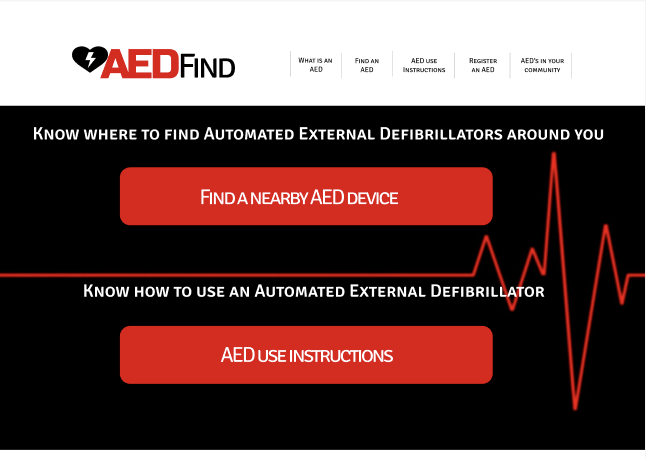
AED Find


Too Long, Didn’t Read
The AED Find project aimed to develop a mobile app that enables users to quickly locate nearby AED devices in emergencies while also allowing for advanced search and preparedness planning. Simplicity and ease of use in crisis situations were top priorities. The project began with user research and competitive analysis to understand existing solutions and gaps. Wireframes were initially hand-drawn, then digitized into a low-fidelity prototype, followed by usability testing to refine the experience. These insights shaped the high-fidelity prototype, ensuring the app was intuitive and functional in high-stress scenarios as well as everyday use. This project reinforced the importance of user-centered design in life-saving situations, balancing efficiency, clarity, and accessibility.
Impact:
Conducted user research and competitive analysis
Designed and iterated on wireframes and prototypes
Ensured intuitive navigation and accessibility
Prioritized clarity and efficiency
Developed a high-fidelity prototype
My Role
For this solo project I am responsible for full research and design of this project
Project Duration
The project follows the 6 month certification course from Google, project duration was 2 weeks
Problem
Create a mobile app to fit a social need. This mobile app should be able to provide a user with instructions on how to use an AED device in an emergency situation, when a user is highly distracted and needs to be able to navigate in an familiar and simple way
Goal
The mobile app must be simple, bold, non-scrolling, with an intuitive and easy to use interface for possible use in an emergency situations
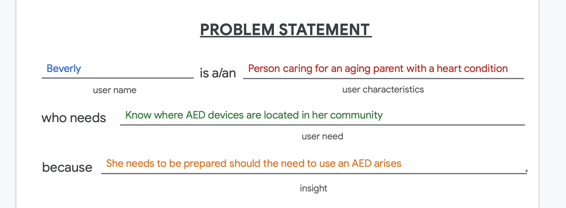
User Personas


Design
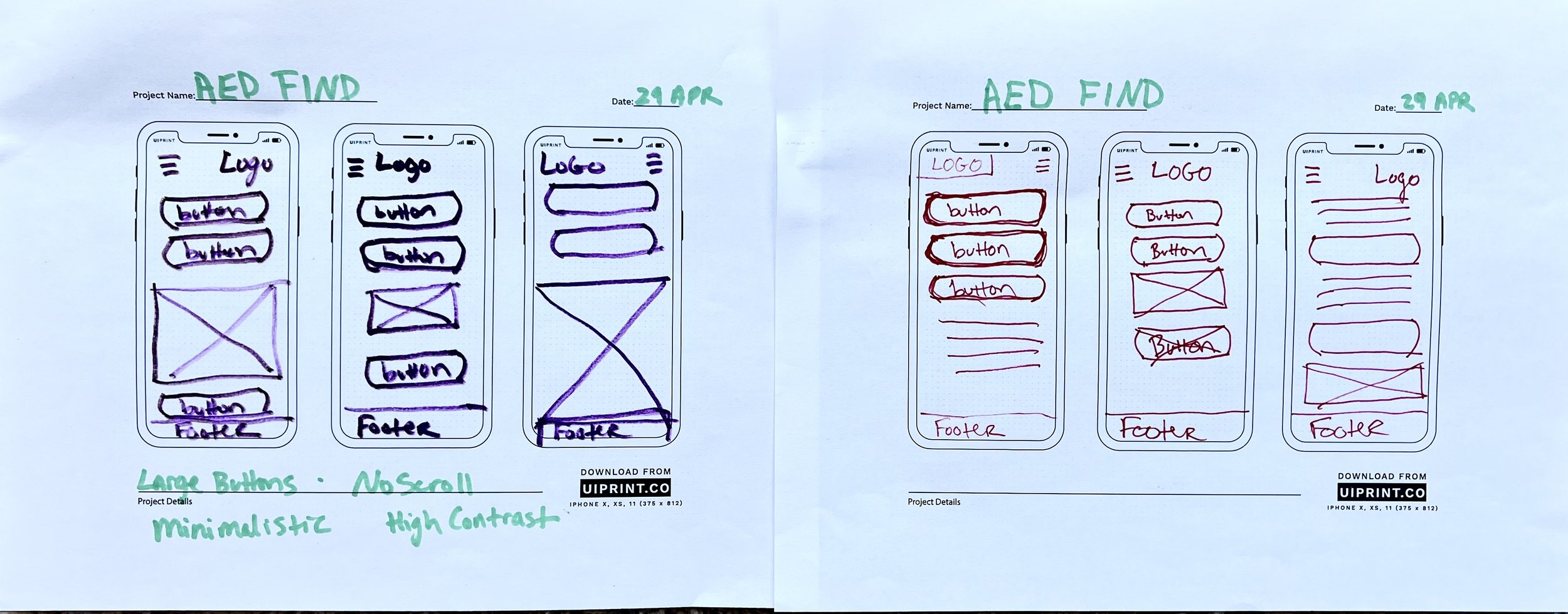
Wireframing.


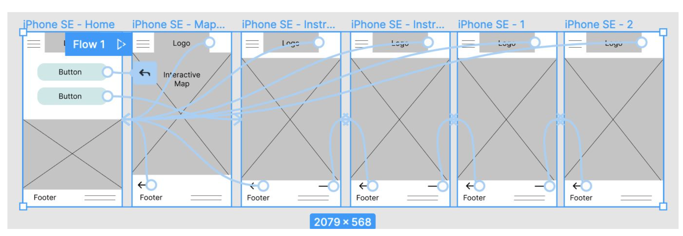
Link to Lo-Fi Prototype
View the interactive low fidelity prototype on Figma


Usability Study


High Fidelity Prototype
A High Fidelity Prototype of the app designed in Figma


Link to Hi-Fi Prototype
View the interactive high fidelity prototype on Figma
Accessibility
Colors
High contrast colors for simple readability and accessibility
Fonts
Large readable fonts for easy viewing and accessibility
Simple Navigation
Large buttons are implemented to make navigation simple and limiting user errors
Voice Prompts
A future iteration may include voice prompts for the instructional section

Take Aways and Next Steps
Take Aways
Impact:
This app is designed to assist in saving a persons life, and being able to successfully navigate the app in time of need is quite possibly a life or death situation. Nothing about the design is taken lightly, the user experience needs to be flawless.
What I learned:
Designing for super simplistic and easy navigation. Minimalist content, only the absolute requirements is needed for the app, while having the capability to expand on a companion website.
Next Steps
1) Hand off designs to production
2) User research with a fully functioning app to make certain the navigation is as user friendly as it could be
3) A possible expansion of the instructions including voice prompts to assist a user who is unable to hold the phone while in the moment