

Vacay


Too Long, Didn’t Read
The Vacay project focused on developing a fully responsive website with mobile-first design as a key priority. It began with user research, identifying pain points and mapping the user journey, which shaped the information architecture and site structure. Wireframes were initially sketched on paper, then digitized, leading to a low-fidelity prototype for both desktop and mobile. A usability study provided critical insights, allowing us to refine the design into high-fidelity prototypes optimized for both platforms. This project reinforced my ability to design responsive experiences holistically, ensuring seamless functionality and usability across devices.
Impact:
Holistic Responsive Design with attention to Mobile First
User Centered Approach: User research drove design decisions
Optimized for Usability: User testing informed the iterative design
Brand Identity: colors, logo, and style established
My Role
For this solo project I am responsible for full research and design
Project Duration
The project follows the 6 month certification course from Google, this project spanned 3 weeks
Problem
Create a responsive website that works on multiple formats such as web and mobile devices
Goal
Create a visually appealing site that works on multiple platforms that addresses the users needs
User Research

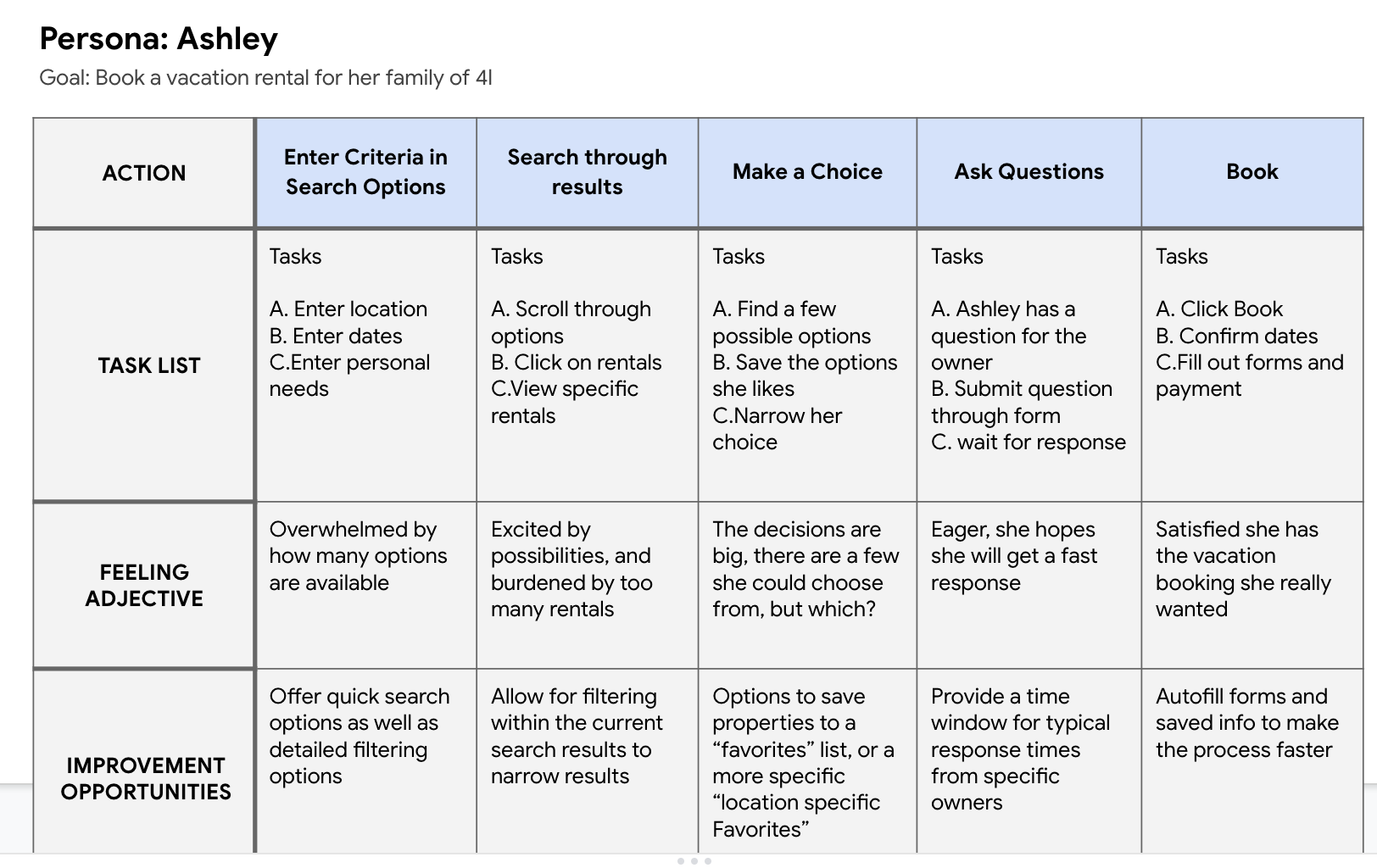
User Persona
Research Points
Pain Points
Filter Options Users would like the option to add search filter criteria on the main page before the initial search is conducted
Map View Users would like an option to see the search results on a map view
Roll Over Text Users would like to see roll over text provided for icons such as amenities to be better able to understand the icons at a glance
Date Change Users would like the option to edit dates on the search page as well as editing the dates on the search results page
Research Questions
Can the user refine search criteria effectively to find what they need?
Does the search functionality allow both broad and specific queries?
Does the user find the number of clicks required to complete the task reasonable?

Journey Mapping
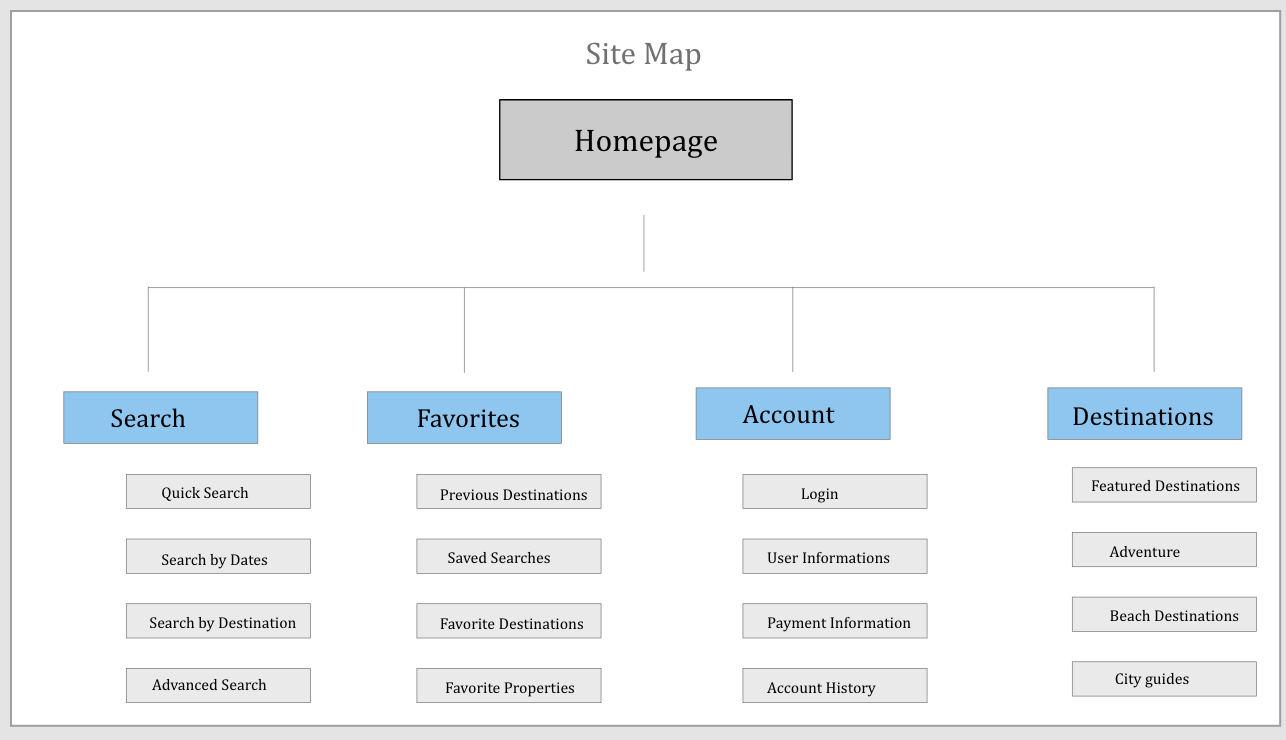
Information Architecture
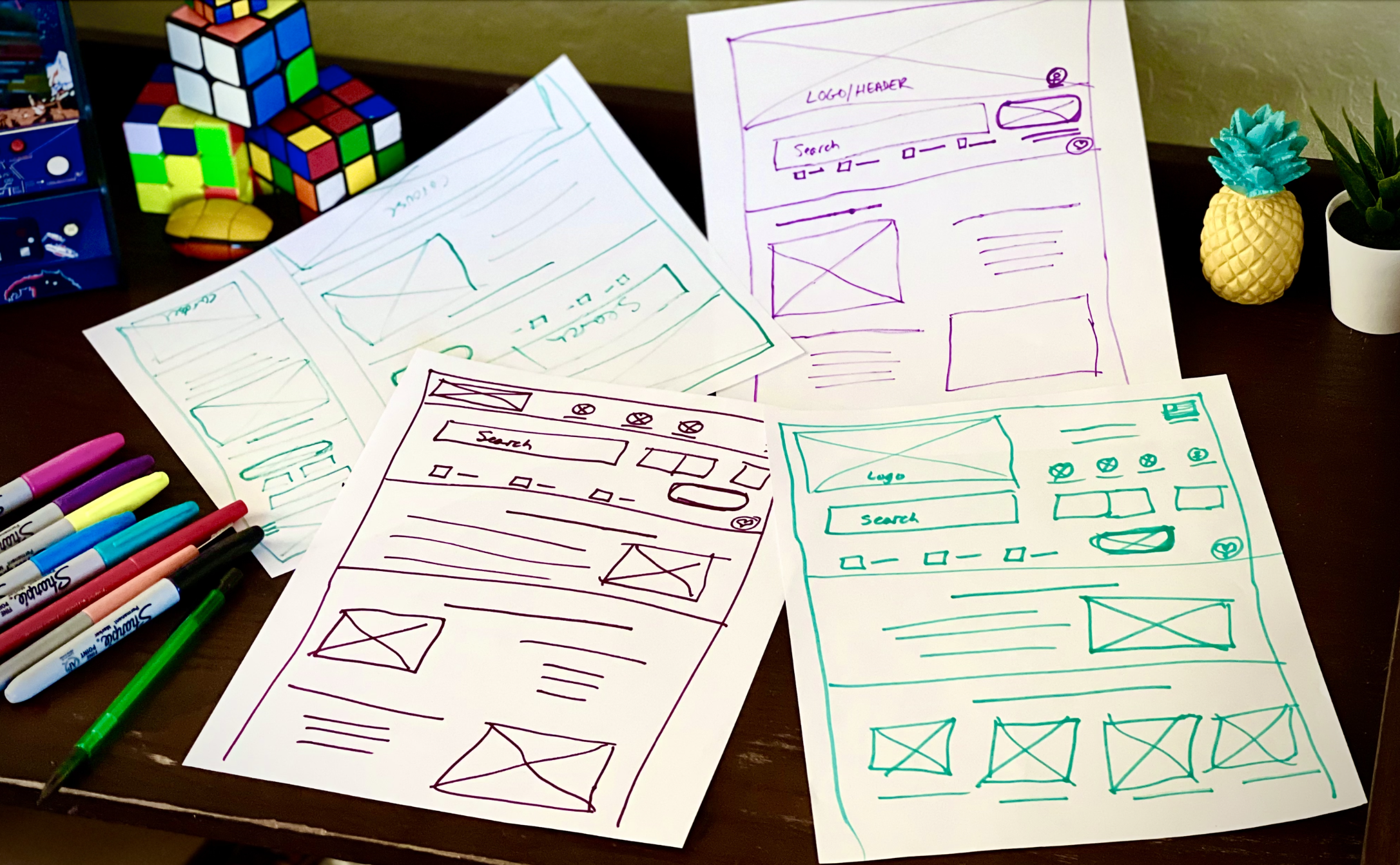
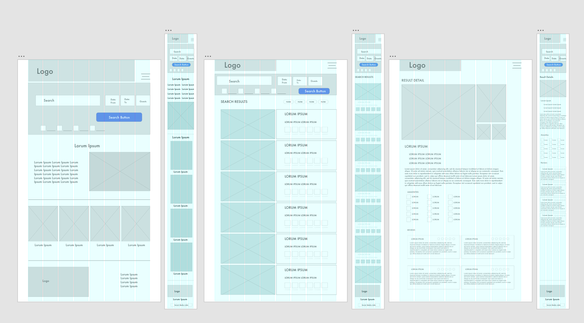
Wireframing.
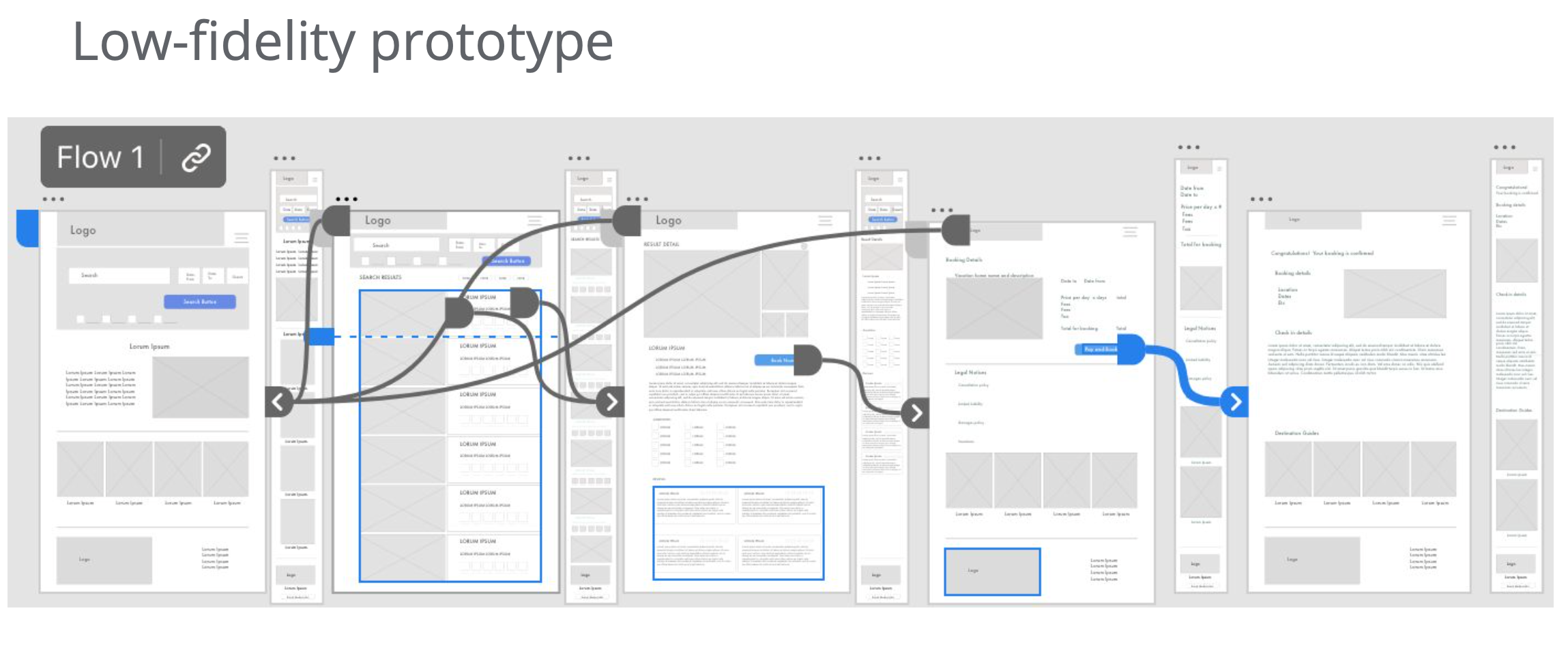
Usability Study


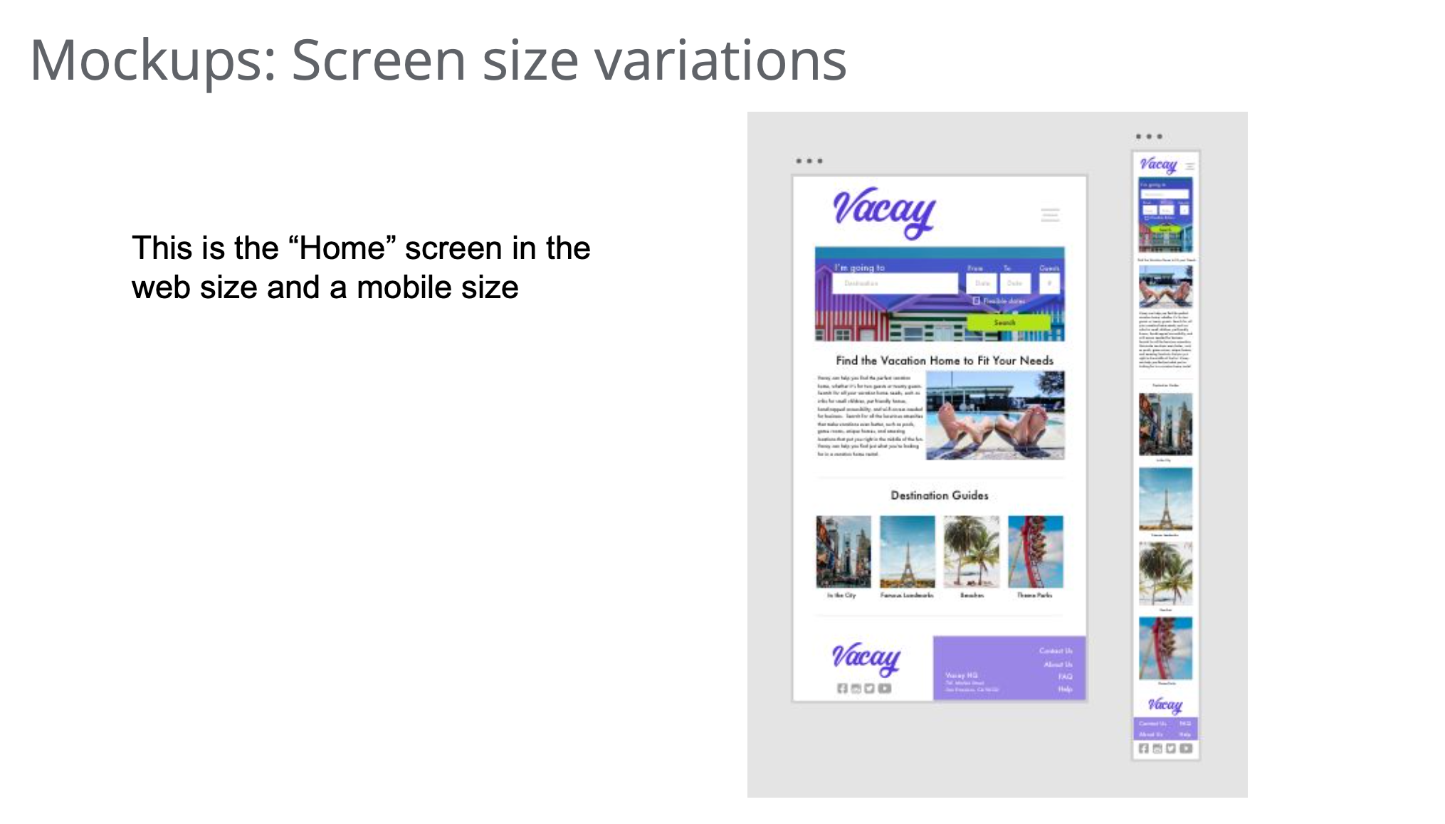
High Fidelity Prototype
A High Fidelity Prototype of the site was designed in Adobe XD

Accessibility
Colors
Contrast ratios are checked for accessibility considerations
Hierarchy
Headlines and proper hierarchy are implemented to assist with screen reader capabilities
Alt Text
Alt text and captions are used with images to aid with the screen reading
Take Aways and Next Steps
Take Aways
Impact These designs will give the users the flexibility to search and find what they are looking for with ease as well as latitude. With such a wide range and variety of users, this platform must have a wide array of options to suit each user.
What I Learned Designing for multiple screen sizes must always be a strong consideration, great designs do not always transfer from one screen size to another.
Next Steps
1) This project could be expanded significantly to include many widget and filter options
2) Streamlining the search capabilities for mobile
3) Handing off the project to the dev team for production